The challenge
To elevate NaturaDerma natural cosmetics brand from the Baltics to a new level: create a brand identity associated with trust, purity and professionalism — but without medical coldness. We needed to hit the visual sweet spot between pharmacy and lifestyle to make both doctors trust it and bloggers fall in love with it.
How it was
Jars and tubes looked like "marketplace templates": mismatched fonts, loud colors, clichés like "100% natural" that no longer convince. The packaging was more off-putting than inspiring. Social media was filled with stock photos and quotes about femininity. Customers left good reviews, but no one was talking about the brand — visually it just got lost.
What we did
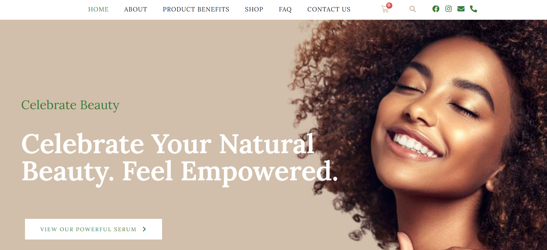
We adopted a pharmacy aesthetic — minimalism with hints of science and care. The color palette: mint, white and a touch of graphite. Added elegant illustrations of medicinal plants, strict typography and personalized Instagram cards with care tips. All packaging now says: "I'm clean, honest and will definitely help you."
The result
In the first quarter after rebranding, marketplace sales grew by 40%, product cards achieved high CTR, and the brand was included in localbeauty.eu's best eco-brands selection. Now NaturaDerma cosmetics don't just treat skin — they treat visual fatigue from sameness.
